The problem
Many educational institutions use a student information system (SIS) to manage student enrolments. This project intended to provide a new user experience to build on an MVP version made by another team.
After looking at the MVP, it became immediately clear that the workflow was going to be overly complex to expect a user to complete.
What I wanted to learn
We had a completed MVP for this project to build off. However, we were unsure if the MVP had been built in a way that met the customer's needs.
We wanted to focus our research on how student information systems are used, if we can use any of the work already done in the MVP, and exploring ways to present the complex workflow in a way that wouldn't be too overwhelming for the user.
What we found
- The MVP included all the information needed to complete the process, but it was presented in a way that was difficult for users to understand.
- The workflow would mean that the user has to do things within our app and within the student information system to configure it.
- The student information system was often controlled by someone who may be unfamiliar with our app.
- Several parts of the workflow could have significant periods where our systems hadn't synced with each other yet, with little the user could do to speed it up.
What I did
- I decided that we'd split this workflow up into steps. Users would be able to leave the workflow at different points and come back to it to complete the process. We'd give as much information as we can when there are periods the users have to wait to prompt them to return later.
- The explanatory text should be used to provide immediate context and give structure when users return to process at a later point.
- We'd break things into steps wherever possible. Steps would be described upfront and reinforced wherever possible.
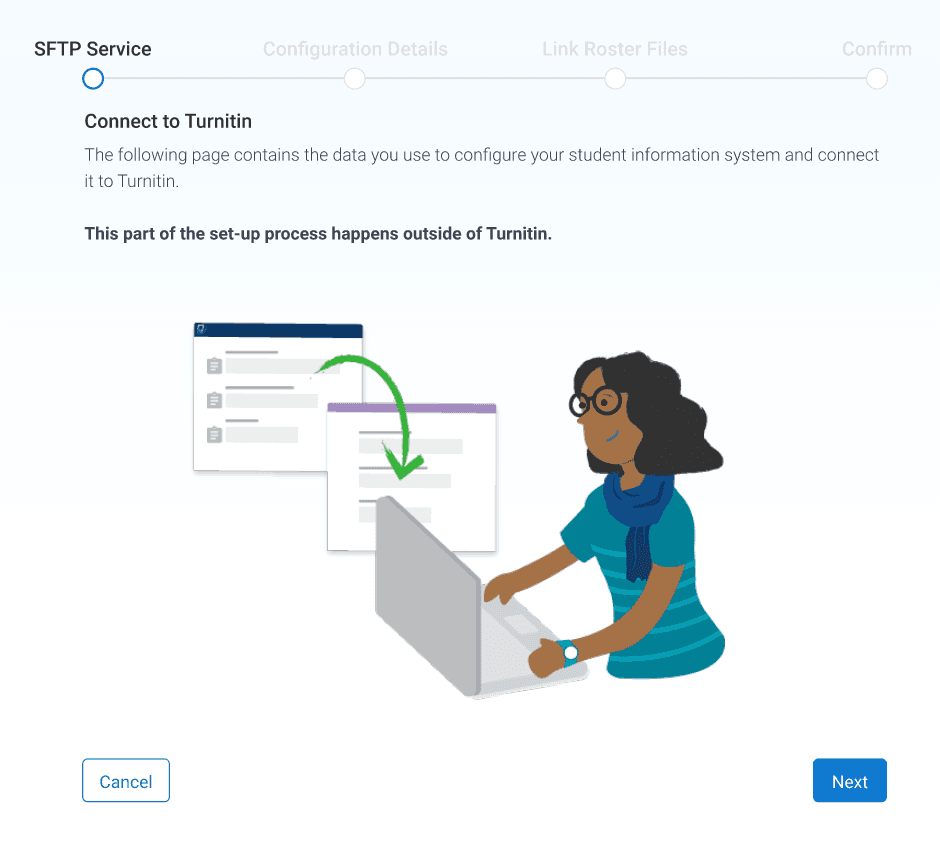
- We'd clearly state where users have to leave the app to configure elsewhere. Then, when they have to go through the app, we will provide extra contextual information for them to refer back to.
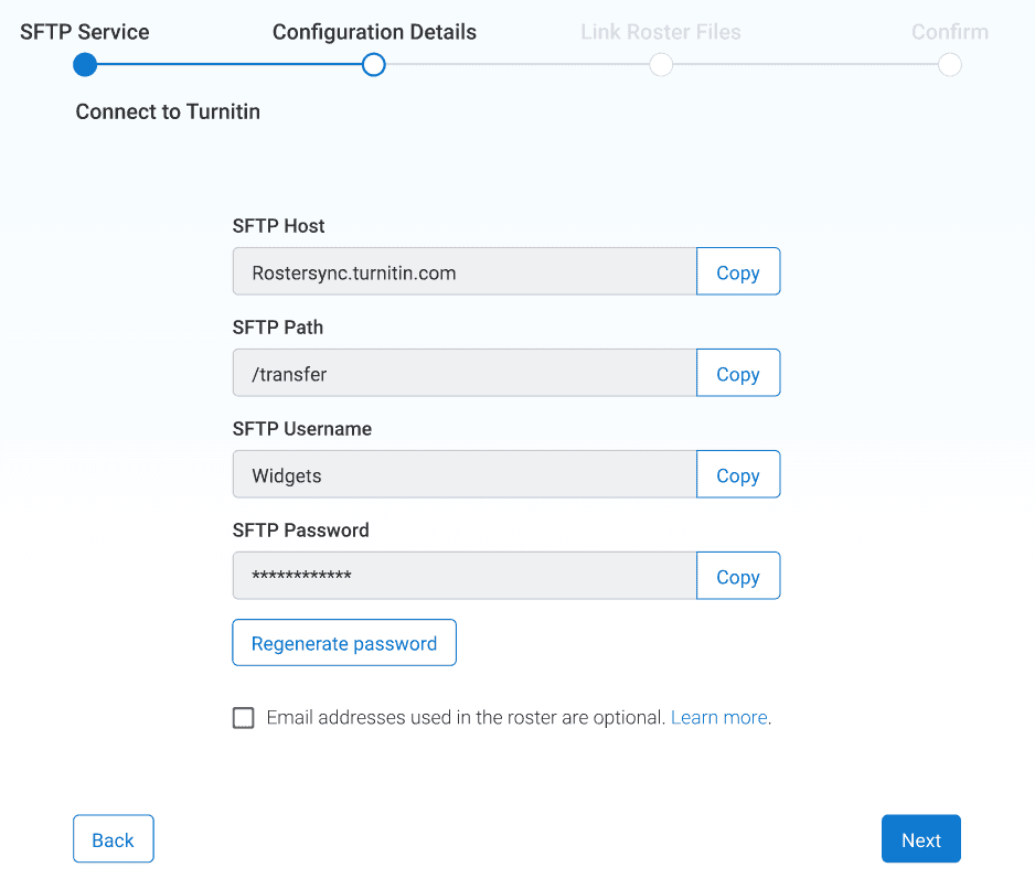
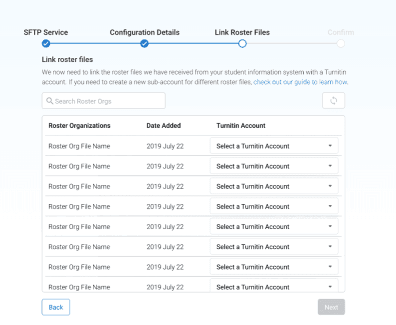
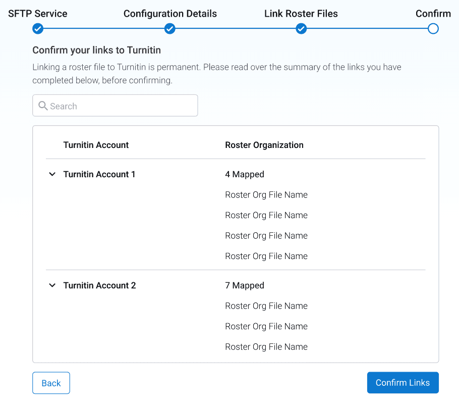
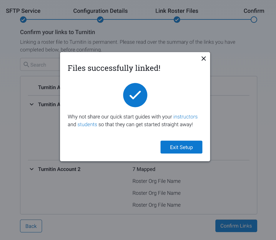
Every string on the screen was a decision
Open any one of these and I will tell you why it is worded that way.
As the process requires the user to follow a complicated journey between our app and elsewhere, we introduce it upfront to set their expectations.