The problem
We had no centralised area where users could go to learn about potential problems with our products. Because we have many different access paths that plugin to many different environments, it is often difficult to know if something is a new problem or something that a single institution was experiencing.
We needed an area where users could go to self-serve this information before going to the support team for extra help.
What I wanted to learn
I knew that there were problems but I didn't know why users had trouble finding out information about them. I decided to tackle this stretch of research in two ways.
I'd first work with our Support team to understand the issues they commonly saw repeatedly. What were the things that multiple users would contact them about? Parallel to this investigation, I would engage our Integrations team to get involved with their daily talks with users.
What we found
- There were 32 different access paths that a user could potentially be coming from. Sometimes the user would simply not know which one they were coming from or only know a name with very little other context.
- Users expected to see progress with the items added to the page. It couldn't just be a static resource.
- Time was a significant factor when assessing if they should contact support. If they are a new user, it was very unlikely they'd look on a list of items from years ago.
- Administrators, who were the primary audience here, are responsible for multiple apps in addition to ours. They needed an easy way of being notified of any updates without checking the same page daily.
What I did
- All of the content for this project would be designed to provide timely context to the user. Most felt they could self-serve, as long as they weren't left to become lost looking for the content that was relevant to them.
- Each access path follows a simple hierarchy that followed the patterns of behaviour we saw in our research. The top-level filter would be the Learning Management System (which we knew they were most likely to know), and then increase in specificity for those who knew what to look for.
- Each access path would have its own RSS feed users could subscribe to.
- I would create several 'pill' elements that would provide further context for each item and its current status.
- The page would dynamically fill based on the page within MadCap. JavaScript would be used to change elements to fit the context the user wants. For example, a dropdown allows the user to choose the most relevant integration for them. This would filter the items shown to only the most relevant, but also update the last updated and RSS feed sections.
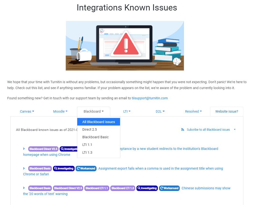
Every string on the screen was a decision
Open any one of these and I will tell you why it is worded that way.
It was important to introduce this page in a supporting voice. Users are already frustrated by not being able to access the app. Giving them false platitudes would not help anyway. We would acknowledge that there are potential problems, and try to help them.