The problem
Users have low intentionality, but high fit with this tool once they understand its purpose. It's the tool they never knew they needed.
This has resulted in poor conversions for the tool and a lack of investment by the company. Our goal was to elevate the experience, fix any 'paper cuts', and better guide the user through what can be a complex process.
What I wanted to learn
With this project, we decided on a fully moderated approach. We'd talk to users, look for that 'aha!' moment that makes the feature click for them, and look to focus in on what was driving users away.
What we found
- Users struggled to understand that this was not a tool of multiple steps, but rather a collection of tools they can pick and choose from.
- They didn't realise that on the first screen you can create a library of images to edit, they were stuck in the mindset of 1 image = 1 design.
- After visiting a sub-tool, users would get lost and not know what their next 'step' should be, so they'd abandon their changes.
What I did
- As this tool exists outside the Picsart main editor, there were not many notes of familiarity that a user could scaffold their understanding around. We'd look to bring the familiar, while still selling the benefits of the feature.
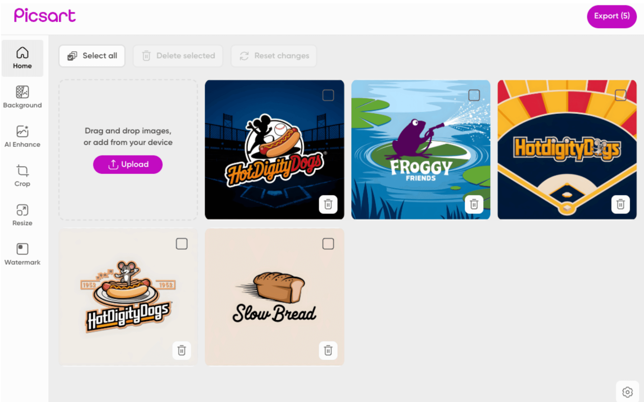
- I changed 'Upload' to 'Home'. This made users feel like there was always a place to check back to. It brought them out of their confusion around needing to go to a new step, and instead started to feel like they had a central 'review' hub and then tools that would change the images within it.
- We introduced several new buttons at the 'Home' level to further cement the idea that it's somewhere to return to. As the users would see the inactive 'Delete selected' buttons etc, they naturally internalised it was a place to manage and maintain their images.
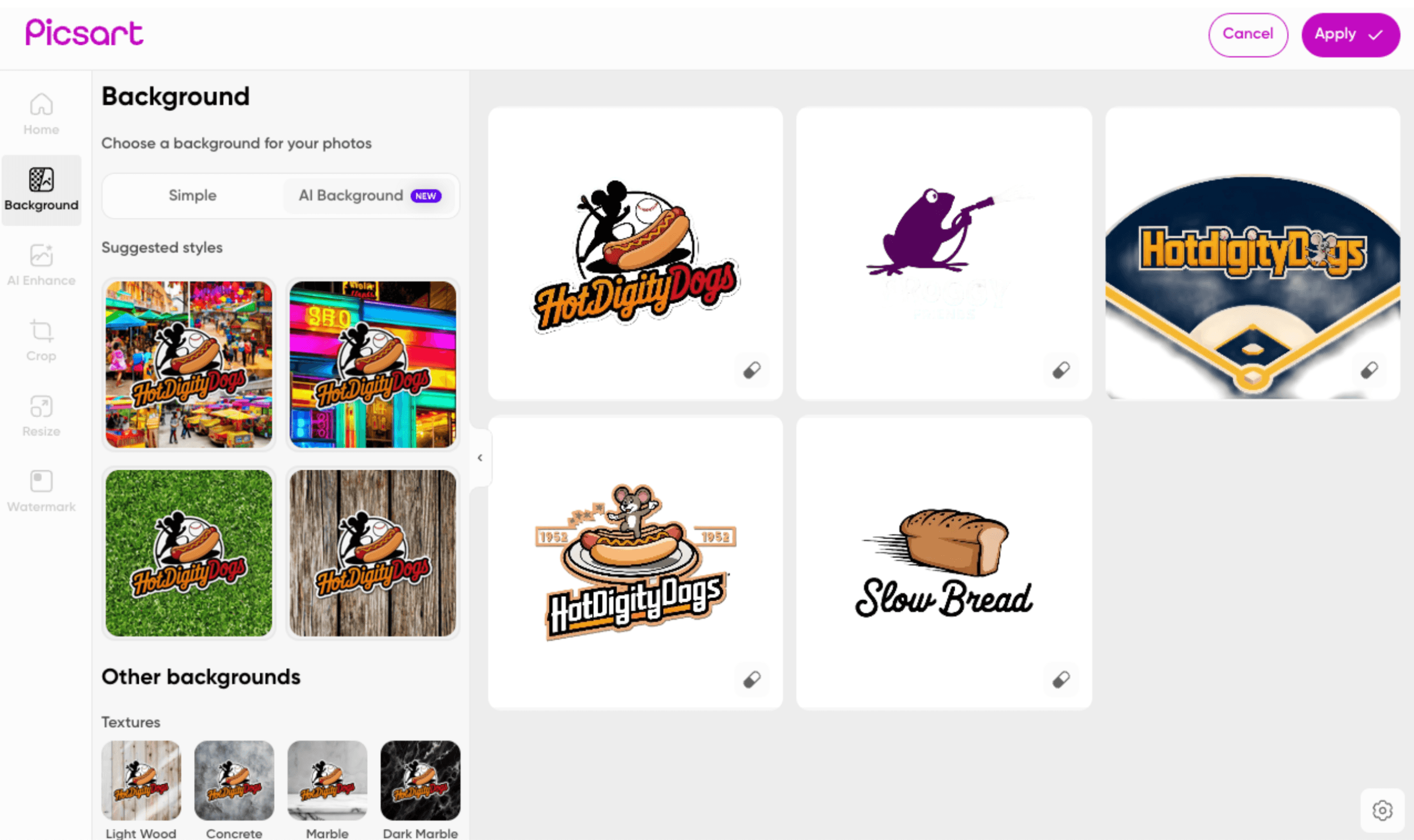
- At the sub-tool level, we brought in language from elsewhere in the app. I advocated that we didn't need to reinvent the wheel, and the sense of familiarity would be better than something uniquely tailored to a batch workflow for the sake of it. We told that story already at the Home level.
Every string on the screen was a decision
Open any one of these and I will tell you why it is worded that way.
A simple way to bypass manual selection and get to the fun parts faster. Even knowing it is there reduces the potential for manual work as a source of frustration.
What happened
Conversion went from 2% of users to 30%, and we saw a 12% increase in pMAU from users subscribing to use the feature more.